
Case Study
Brenda Hostettler
P H O T O G R A P H Y
A local business that renders portrait, family, engagement, couple, maternity, headshots, individual and group photography sessions.
This project originated from a real-world experience. While trying to book a photography session with a local photographer, I encountered multiple usability issues that prevented me from completing the booking process. This experience prompted me to evaluate the website from a UX perspective and redesign the experience to better support users in discovering services, navigating content, and confidently scheduling photography sessions. The goal of this project was to transform a visually appealing site into an intuitive, trust-building experience that guides users seamlessly from exploration to booking, while aligning user needs with business objectives.
Problem
The primary Call to Action (CTA) for booking a photography session leads to a broken link, preventing users from comple
Non-intuitive navigation and inconsistent section labeling make it difficult for users to find essential information such as services and booking details.
The site lacks credibility-building content, including client testimonials and informative resources, which lowers user confidence.
These combined issues create user frustration, reduce trust, and disrupt the overall booking experience.
Solution
To address these challenges, I redesigned the website experience with a focus on clarity, trust, and conversion. The core of the solution is a streamlined and intuitive booking flow that allows users to schedule a photography session effortlessly.
A prominent, fully functional booking flow became the foundation of the redesign. I introduced clear, well-placed CTA buttons throughout the site, supported by informative prompts that guide users naturally toward scheduling a session.
To strengthen trust and engagement, I added client testimonials and informative content that highlights real experiences and the photographer’s expertise. These elements provide reassurance, reduce uncertainty, and encourage users to take action.
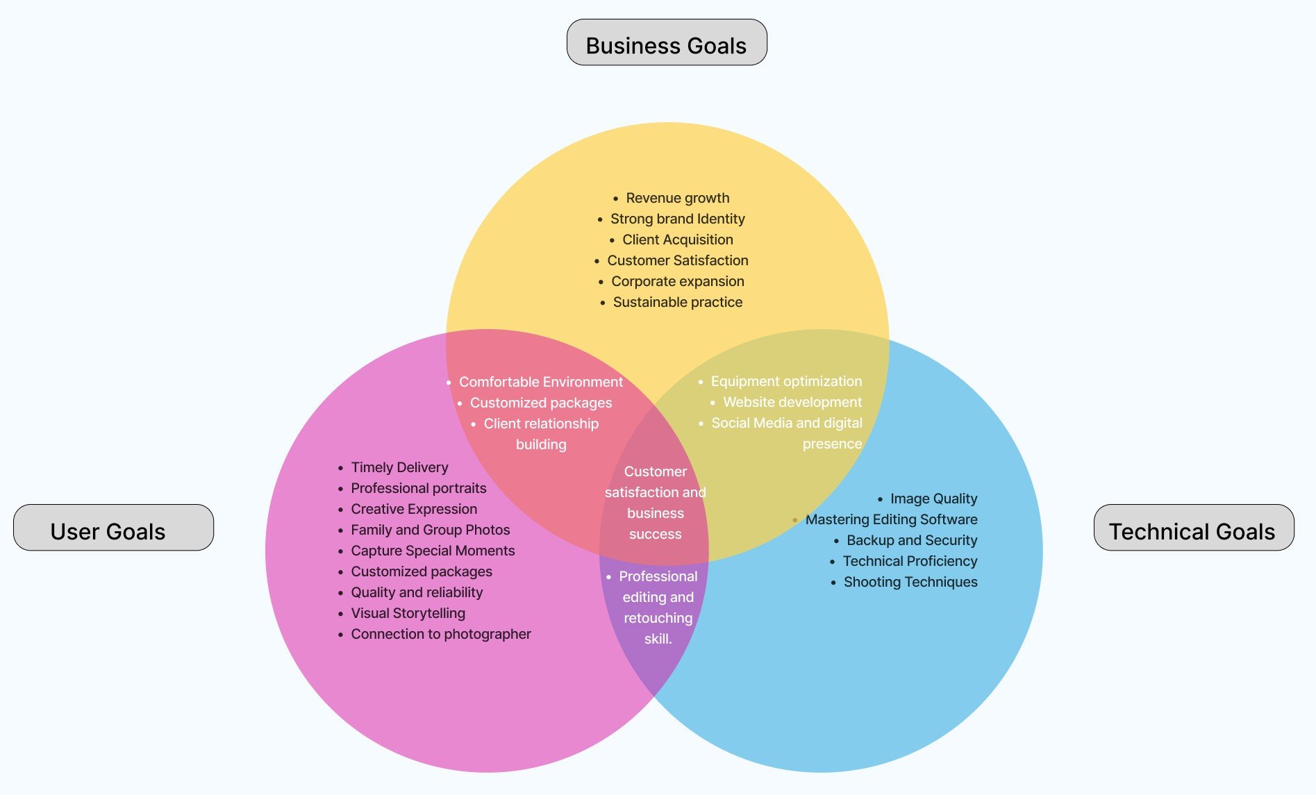
Goals
The goal of this project was to align user needs, business objectives, and technical capabilities to create a seamless photography booking experience. By making it easy for users to discover services and book sessions, strengthening the brand’s online presence to support client growth, and ensuring reliable, high-quality technical execution, the redesigned experience supports customer satisfaction while driving sustainable business success.
My Process
Research
*
Define
*
Ideate
*
Design
*
Prototype
*
Test
*
Iterate
*
Research * Define * Ideate * Design * Prototype * Test * Iterate *

The website has too many pictures, making it overwhelming.
- Lucia
I found some photo poses in the gallery and incorporated them into my shots.
- Ana


Affinity Mapping
Gallery was visually appealing with highly professional quality photos.
- Diane
They offer several holiday and fun-inspired themed session.
- Matt
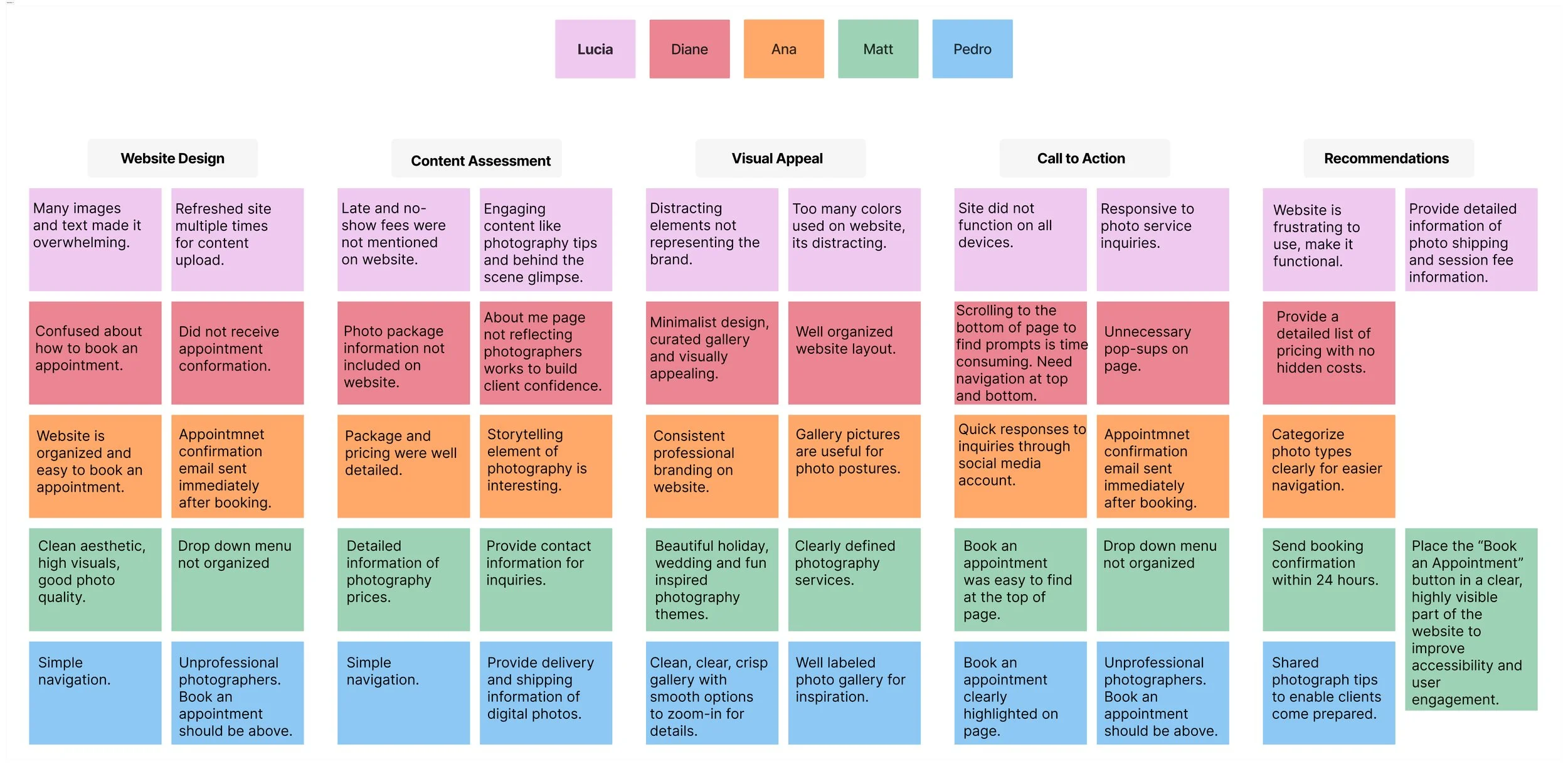
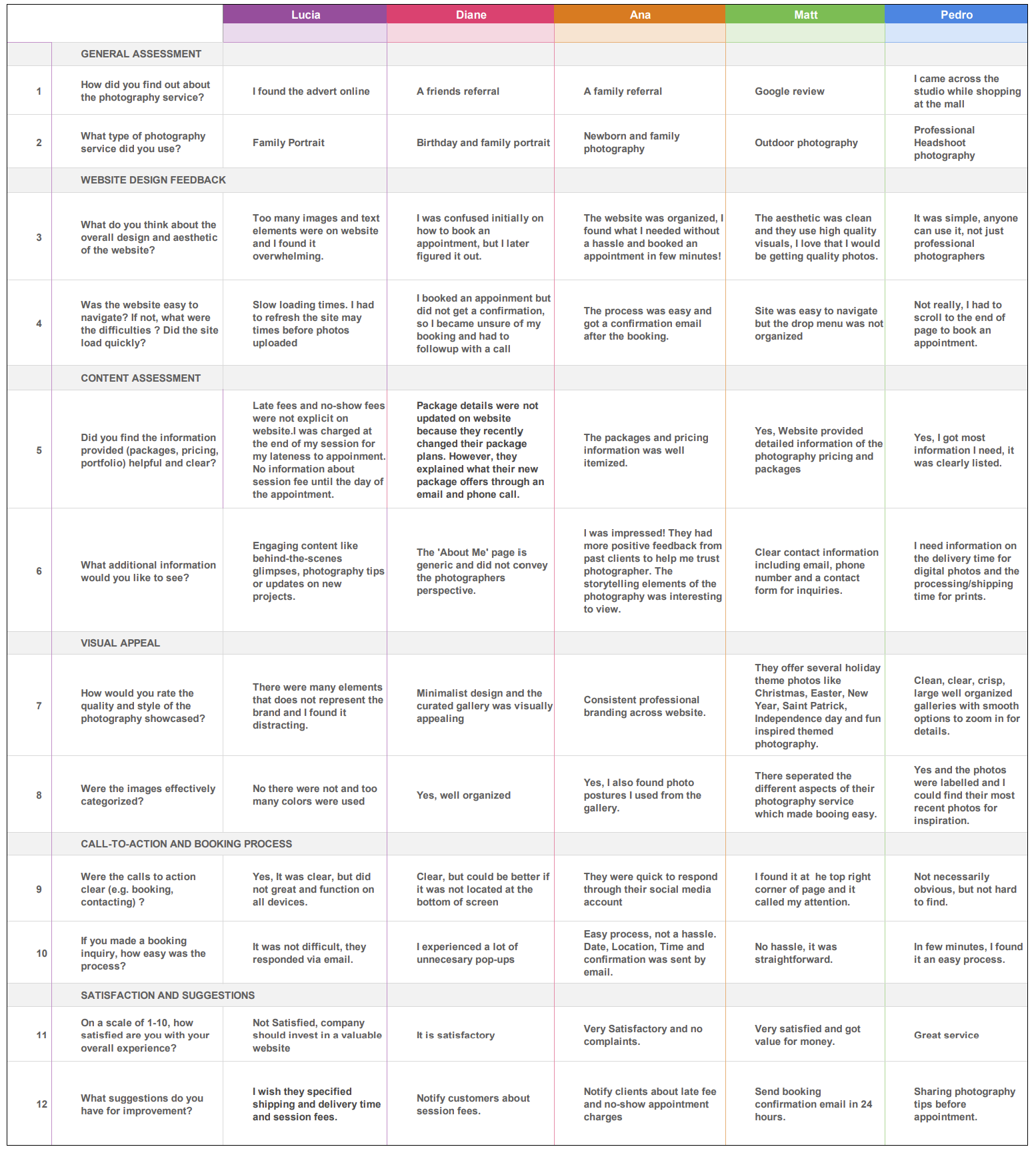
Conducted user interviews with 5 real photography clients to understand their needs, preferences, and behaviors when visiting a photography website.
Users trusted the photographer’s work and appreciated the clean aesthetic, high-quality visuals, and organized galleries.
Several usability issues emerged, including visual clutter, difficulty locating the “Book Appointment” call-to-action, and missing or delayed booking confirmations.
Users expressed a strong need for transparent pricing, clear policies, and photo delivery timelines to build trust and reduce uncertainty.
These insights highlighted an opportunity to simplify navigation, improve booking clarity, and better align the website experience with the professionalism of the photography service.

I wasn’t happy that the booking button was only at the very bottom of the page.
- Pedro
Competitive Analysis
Research
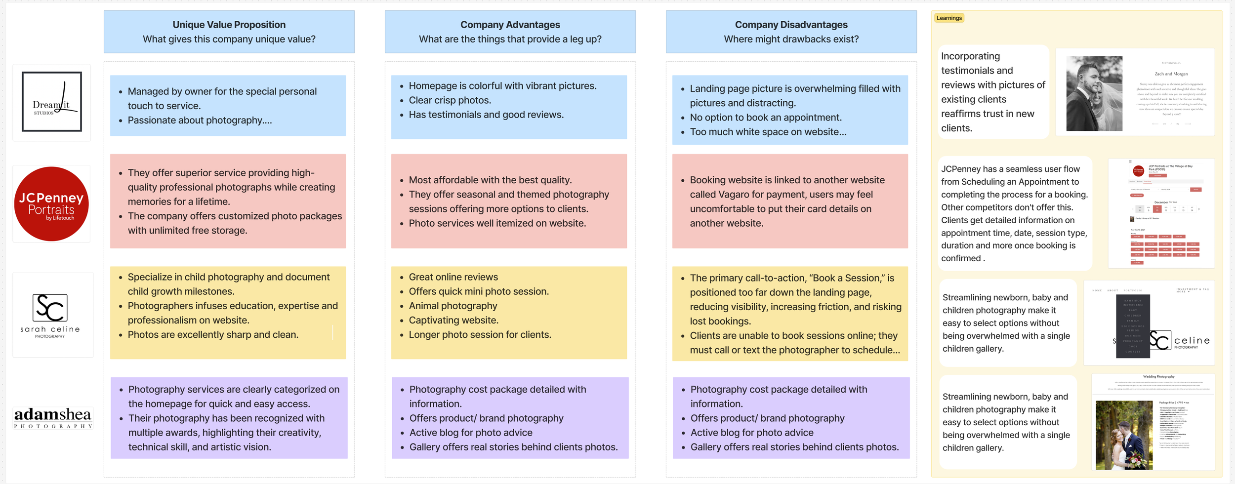
My research analysed four photography sites: Dream it studios, JCPenny Portraits, Sarah Celine Photography and Adamshea Photography and summarized their unique features.
My competitor analysis revealed that while local photography studios offer high-quality visuals, personalized service, and strong reputations, many suffer from poor booking flows, distracting homepages, and unclear session categorization. The biggest gap in the market is the lack of a seamless, user-friendly online booking experience—most require clients to call or text, which reduces convenience and conversion potential.
These insights guided my redesign for Brenda Hostettler Photography, focusing on simplifying navigation, improving clarity, and creating a streamlined booking process that makes scheduling intuitive and stress-free.
User Interviews
To better understand how real clients experience a photography website, I conducted one-on-one user interviews with five participants who had previously booked or explored photography services. My goal was to uncover what users value most when browsing a photographer’s site, how easily they could navigate and book a session, and where friction or confusion occurred. These interviews provided direct insight into users’ expectations around visual presentation, pricing transparency, booking clarity, and trust—revealing key opportunities to improve the overall website experience and conversion flow.

High-Quality Image
Most users need a gallery feature that loads quickly and displays high-resolution images beautifully.
Key Takeaways
Minimalistic Layout
Use ample whitespace and a simple grid layout to let your photographs stand out. Avoid cluttered designs.
Responsive Design
Ensure the website is mobile-friendly and looks great on various screen sizes and devices.
Define
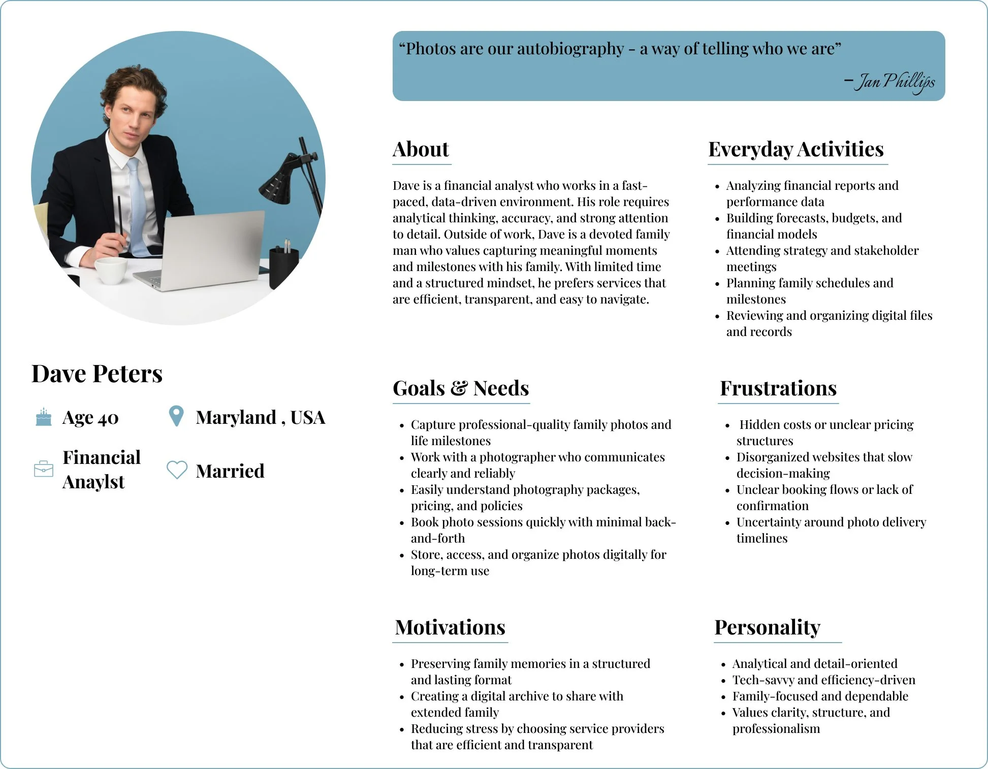
Who is my persona?
Dave Peters is a busy financial analyst and devoted family man who values clarity, efficiency, and transparency. He seeks a seamless photography experience that makes it easy to book sessions, understand pricing, and confidently capture meaningful family milestones without stress or uncertainty.
Ideate
User Flow
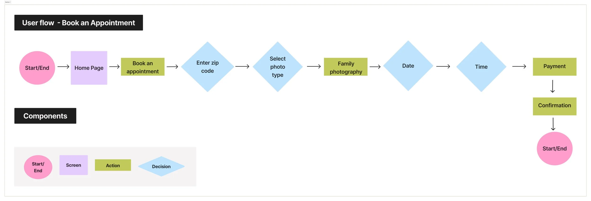
This user flow was intentionally designed to support busy, detail-oriented clients like Dave by making booking straighforward, predictable, and stress-free. By reducing unnecessary steps, clarifying decisions, and providing immediate feedback, the flow improves confidence and aligns the digital experience with the professionalism of the photography service.
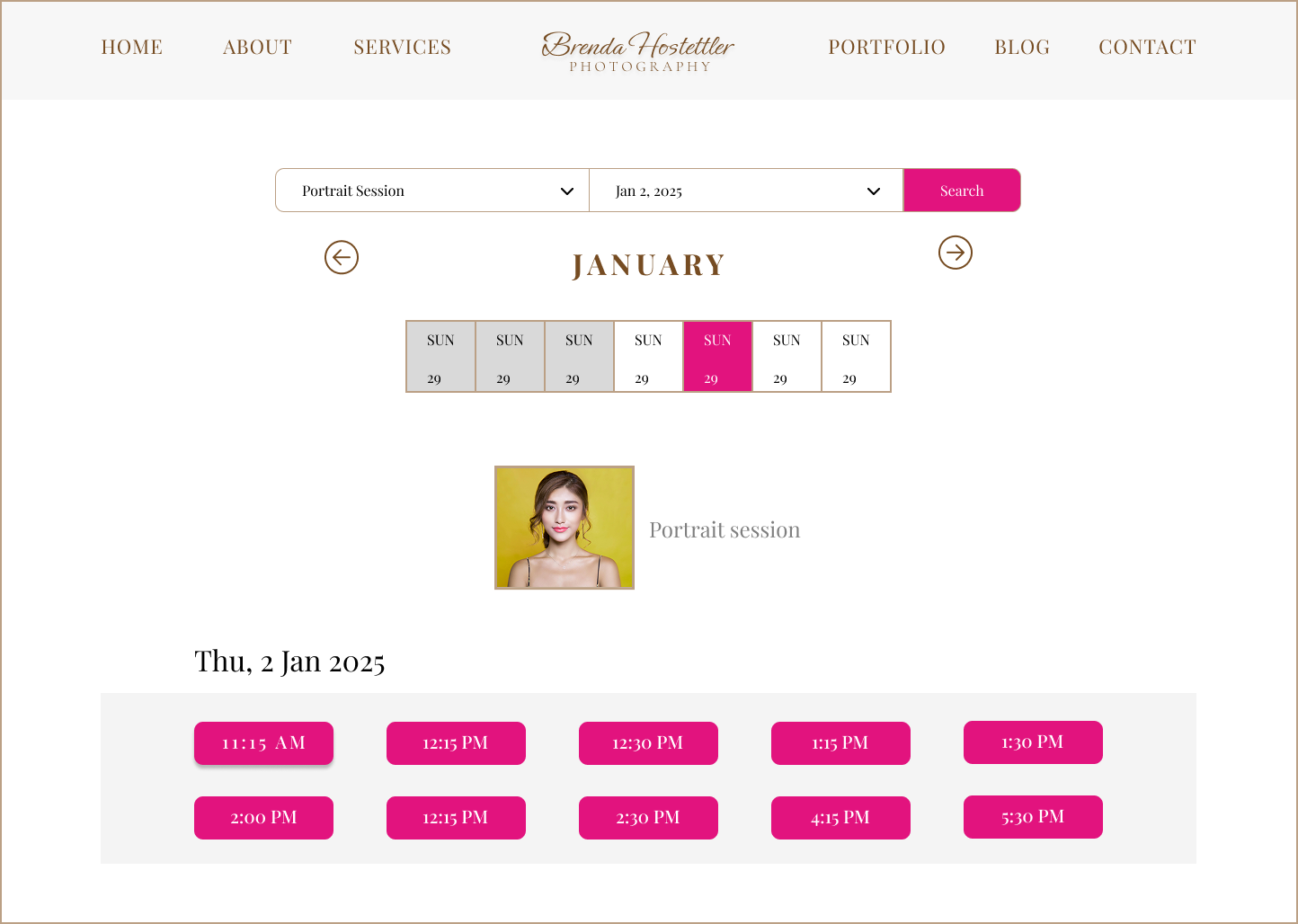
High - Fidelity Screens
Before
Design
Low - Fidelity Screens
I sketched this homepage layout to address key user pain points uncovered during research—especially unclear booking paths and overwhelming content. The design prioritizes a prominent “Book an Appointment” call-to-action, clearly categorized photography services, and supportive content like tips, themes, and the booking process. By structuring the layout differently for mobile and desktop, I aimed to create a clean, intuitive experience that helps busy users quickly understand services and confidently book a session without friction.

High - Fidelity Screens
Prototype
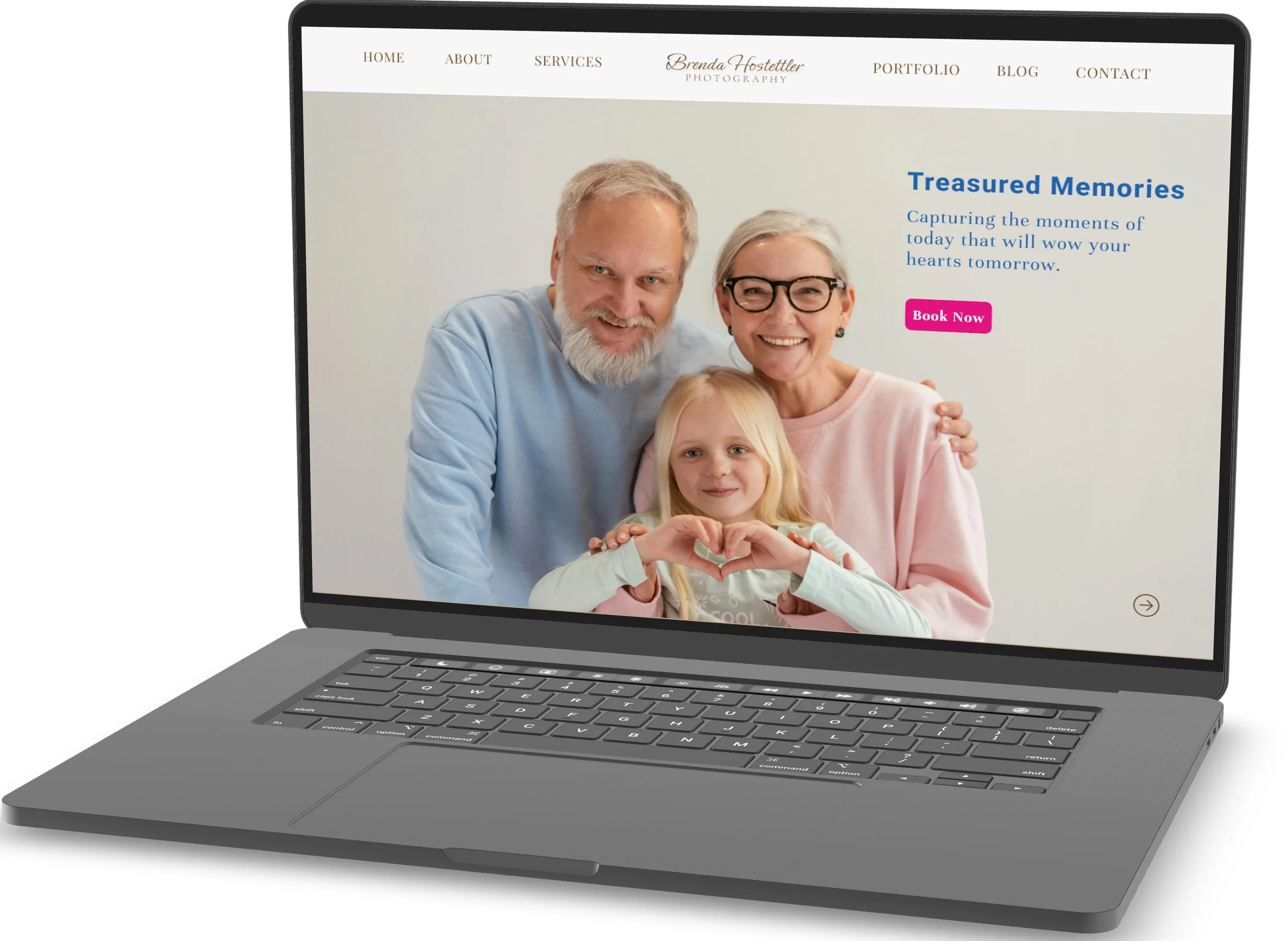
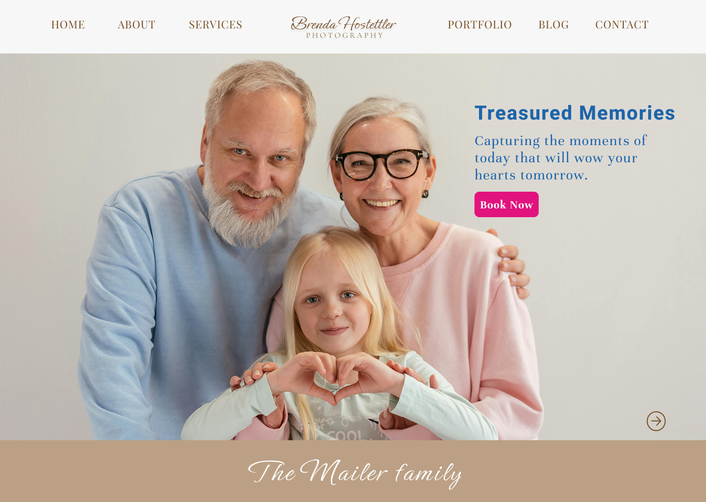
These are high fidelity wireframes that have been meticulously translated from my initial sketches. I utilized various UI kits to create a seamless and functional process designed for users to easily book an appointment on the webpage. This approach not only enhances usability but also adds an engaging element to the user experience. I redesigned the homepage prototype to immediately connect emotionally with families while guiding them toward booking with confidence. The hero section highlights real moments and warmth, paired with a clear value proposition and a prominent “Book Now” call-to-action. By reducing visual clutter, strengthening hierarchy, and placing booking front and center, this design aligns the photographer’s storytelling strength with a clear, conversion-focused user experience.

Test
I conducted moderated usability testing with 5 participants who represented typical photography clients. Participants were asked to interact with the updated Services page prototype and complete booking-related tasks while sharing their thoughts aloud.
Tasks
Participants were asked to:
Review the photography services and read package details.
Identify the service they would like to book.
Click the appropriate “Book” button to proceed with scheduling.
Describe how confident they felt about their selection and next steps.
Key Findings
Poor readability:
Users found the Playfair Display font visually heavy and difficult to scan. Its high contrast strokes and detailed letterforms can feel visually heavy when used for body text.CTA confusion:
Highlighting all call-to-action buttons equally caused hesitation, as users were unsure which action to take next.Unclear decision-making:
Multiple active pink CTAs increased visual noise, making it harder for users to focus on their selected service.Low user confidence: One user reported uncertainty about whether they were taking the correct action, leading to low confidence, second-guessing, and an increased likelihood of abandoning the booking process.
UX Takeaway
Small visual refinements, such as font choice and CTA emphasis, can have a significant impact on user confidence and task completion
Iterate
Iteration Summary (Based on User Feedback)
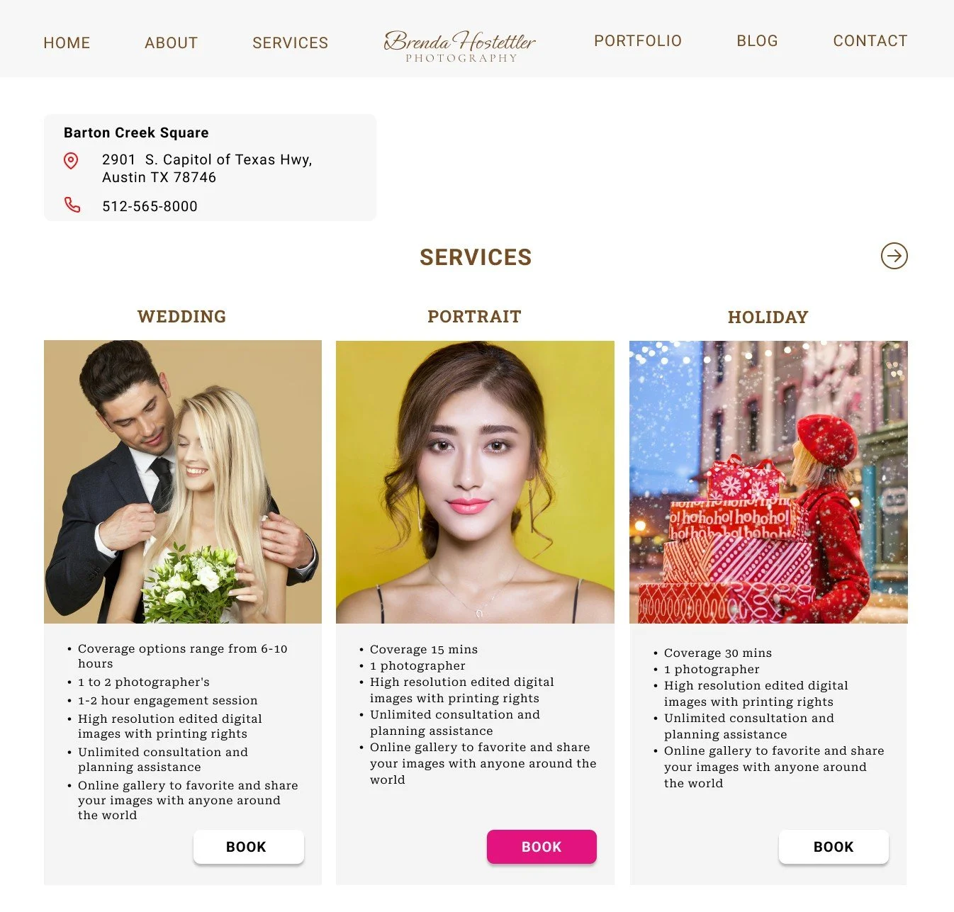
Based on usability feedback, I refined the services section to reduce confusion and improve readability. I replaced Playfair Display with Roboto, an eye-friendly, highly legible typeface, to create a smoother reading experience—especially for users scanning service details and pricing.
I also simplified the call-to-action hierarchy. Previously, all “Book” buttons were highlighted in the same color, which caused users to hesitate and feel unsure where to click. In this iteration, only the active or selected CTA is highlighted in pink, while the remaining CTAs are muted in gray. This visual distinction helps guide user attention, reduces cognitive load, and makes the next action feel clear and intentional.
Together, these changes improve clarity, reduce friction, and create a more confident booking experience aligned with user expectations.
This project reinforced the importance of designing for clarity, confidence, and real user behavior—not assumptions. While the photography itself was strong, user research revealed that small usability gaps in typography, call-to-action hierarchy, and information transparency created friction during booking.
Through interviews, affinity mapping, and usability testing, I learned how thoughtful visual hierarchy and clear feedback can significantly improve user confidence.
This experience strengthened my ability to translate user insights into practical design iterations and reminded me that even small design decisions can have a meaningful impact on trust and conversion.
A seamless booking experience is essential to both user satisfaction and business success. Making it easy for clients to schedule appointments reduces frustration, increases booking completion, and drives sales. A clear, user-friendly website also strengthens brand trust and professionalism, leading to higher customer loyalty and organic growth through referrals.
Final Thoughts
After
Next Steps
Create flows for other Call to Action buttons
Constantly refine user experience and update my research on what users will like to see on a photography website.
Consider implementing a lightbox feature for image galleries, allowing users to view larger versions of images without leaving the page.
Ensure the website is mobile-friendly, as many users may access it on smartphones or tablets.
Validate recent design changes through additional usability testing to confirm improved clarity and user confidence
Fix broken CTA links and ensure a seamless, error-free booking flow
Track key metrics such as booking completion rate, CTA clicks, and drop-off points
Improve transparency by clearly communicating pricing, policies, and delivery timelines
Continue iterating based on real user behavior to further optimize trust and conversion